THE BUSINESS PROBLEM
WHAT WAS GETTING IN THE CUSTOMER'S WAY?
A convenience-led café must feel quick and accessible without becoming visually generic.

Food & Beverage / International
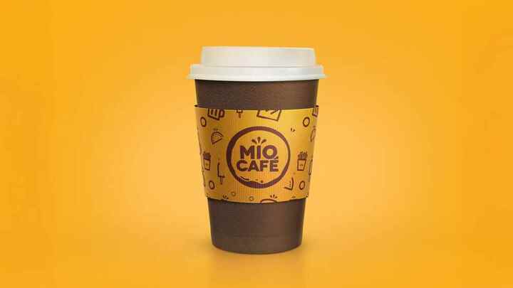
A friendly convenience-café identity that turns a rounded wordmark and compact icon language into an approachable takeaway system.
Market
InternationalIndustry
Food & BeverageScope
Strategy · Identity · PackagingYear
Selected workTHE BUSINESS PROBLEM
A convenience-led café must feel quick and accessible without becoming visually generic.
WHAT WE CHANGED
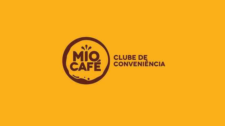
A rounded, energetic signature combines coffee cues with simple food icons and a warm yellow-brown palette.
THE SYSTEM
The identity is designed for cups, sleeves, patterns and compact service moments where recognition must happen quickly.

SCOPE AND VALUE
The supplied pages demonstrate the core identity and takeaway application; wider rollout evidence was not included.
YOUR NEXT MOVE
Tell us what customers misunderstand, what the business has outgrown and when you need to launch. We will help define the right scope.
Brief us on WhatsApp ↗RELATED WORK
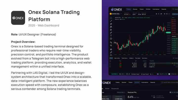
A dense Solana trading terminal reorganized into a composed, scalable dashboard for real-time execution, analytics and portfolio oversight.
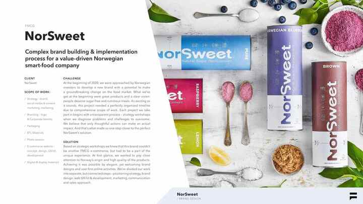
A complete identity and packaging range for a Norwegian sugar-replacement brand, built to stay recognizable across flavours, formats and e-commerce.
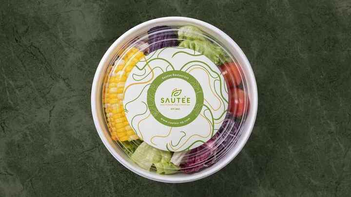
A fresh restaurant identity that brings menu structure, packaging and healthy-food cues together in one confident visual system.